
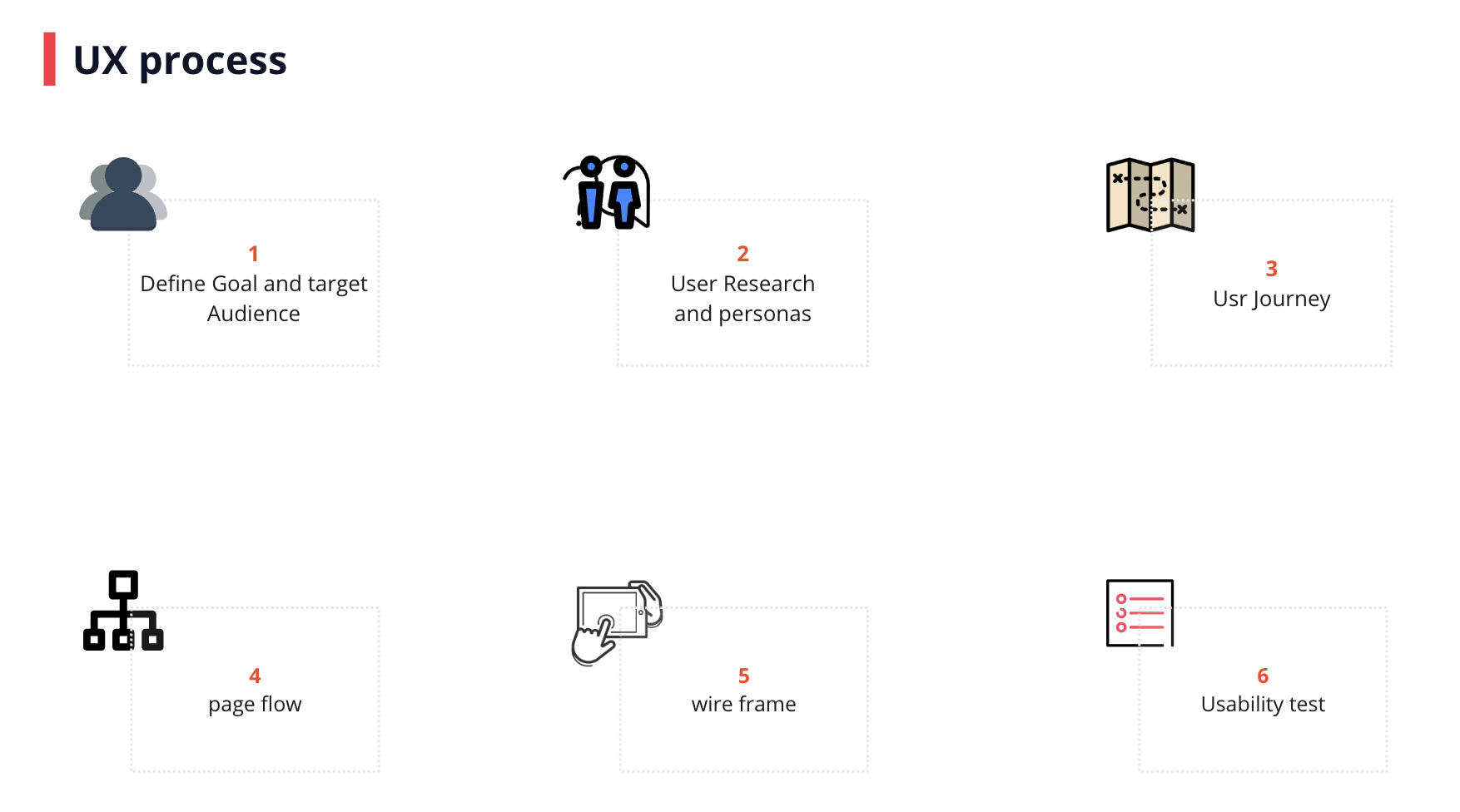
In this blog post, I’ll dive into the exciting journey of creating a language-learning app designed specifically for My daughter. My bigger goal is to create an application that teaches young children essential Thai words while providing an engaging and fun experience for them and their parents. Let’s explore the UX/UI process behind developing the application with a particular user journey, my daughter, and myself.
-
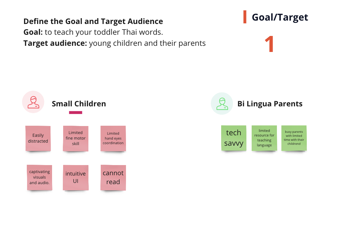
Define Goal and Target Audience: This step establishes a clear vision and direction for the app development process. My mission is clear: to teach toddlers daily Thai words. By connecting children with their parent’s native language, I aim to promote cultural understanding and strengthen family bonds. My primary target audience includes young children and their parents eager to explore language learning together.
-
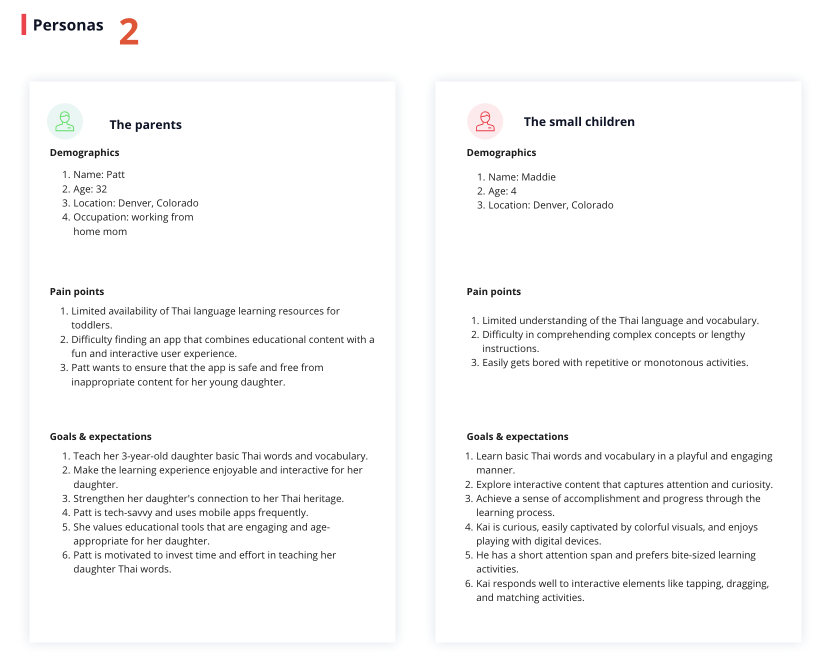
User Research and Creating User Personas: I want to gain insights into user preferences, needs, and motivations. I conducted user research by interviewing her parents (aka myself) and being as observant as possible about how I interact with Maddie. Then I create user personas based on the gathered insights better to understand my target audience’s needs and preferences. From these insights, I developed two user personas: Patt the Parent:
- Age: 35
- Location: Denver, Colorado
- Occupation: Work-from-home mom
- Motivation: Patt realizes the importance of her native language, Thai, and wants her child to learn it to connect with her side of the family.
Maddie the Toddler:
- Age: 4 - Location: Denver, Colorado
-
Motivation: Maddie’s parents introduced her to a new language-learning app for toddlers. She wants to have fun exploring new words and gradually develop her understanding and speaking skills in the Thai language.
-
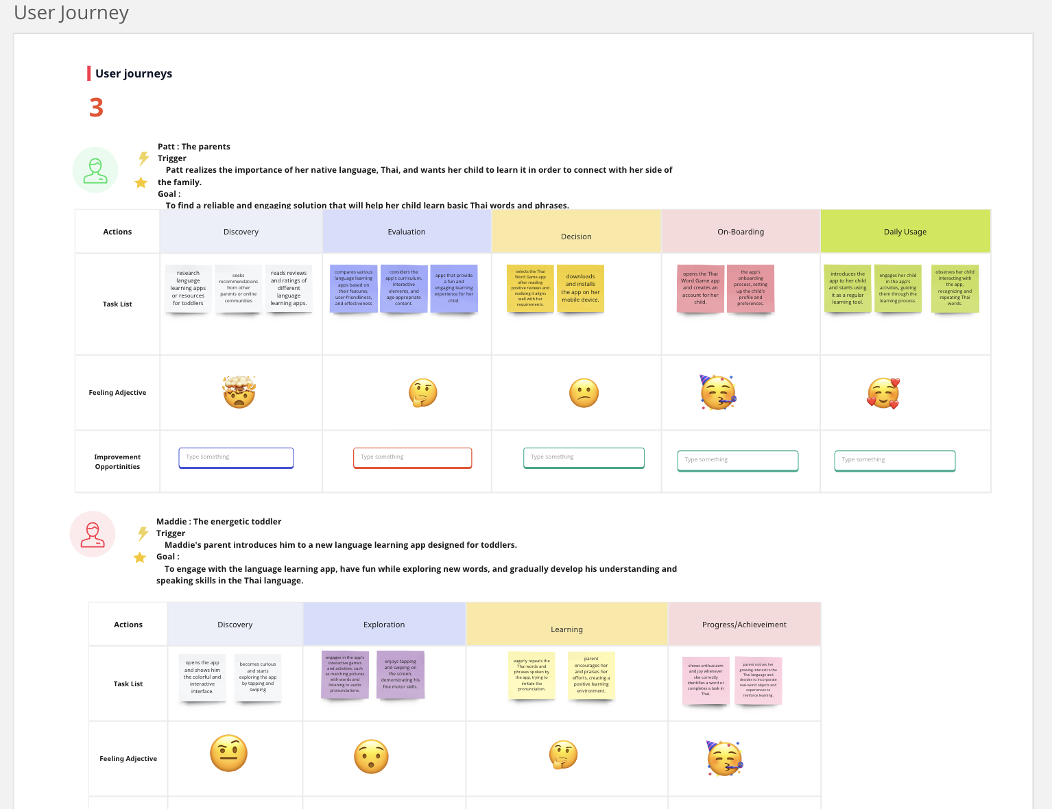
User Journey: In this step, I aim to understand the flow and key touch points of user interactions with the app. Patt, the Parent:
- Trigger: Patt realizes the importance of her native language and wants her child to learn it.
- Goal: Find a reliable and engaging solution to help her child learn basic Thai words and phrases.
Maddie, the Energetic Toddler:
- Trigger: Maddie’s parent introduces her to the language learning app.
-
Goal: Engage with the app, have fun exploring new words, and develop understanding and speaking skills in Thai.
-
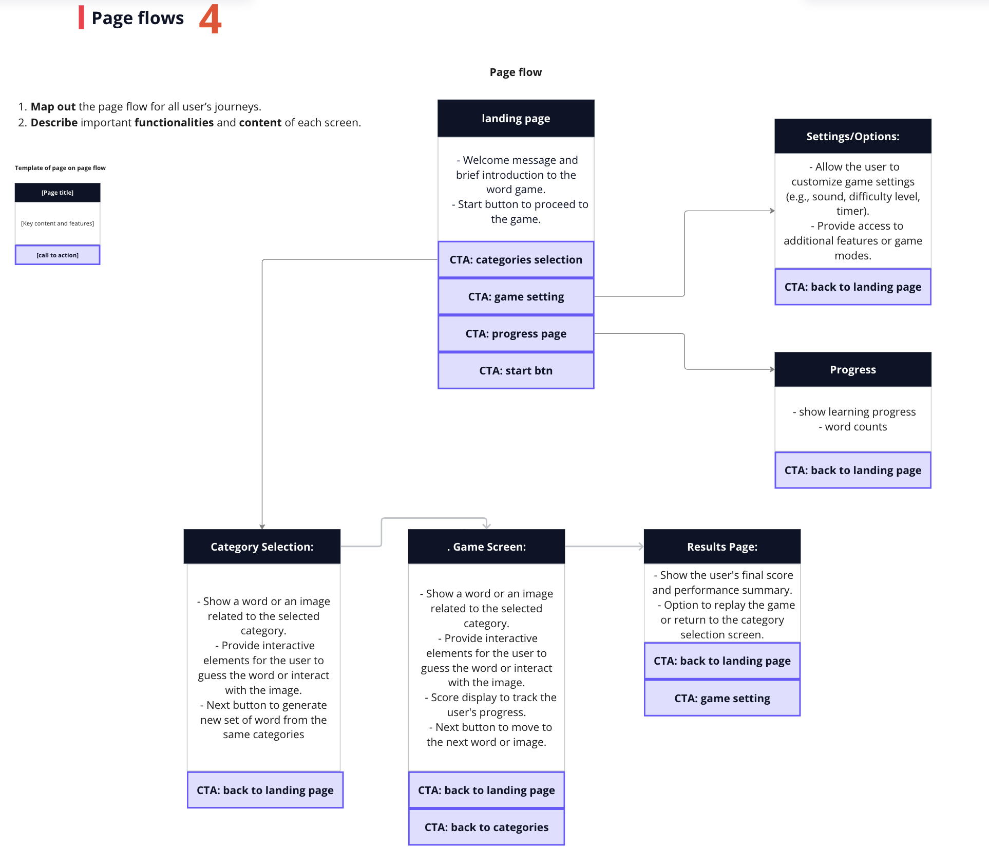
Page Flow: In this step, I aim to design an intuitive and user-friendly navigation flow within the app. I mapped out the page flow for one possible user journey, ensuring easy accessibility to key features and content on each screen. I identified key functionalities and content for each screen, prioritizing simplicity and interactivity. I aim to create an app that is easy for parents and toddlers to navigate.
-
Wireframes: I want a clear visualization of the app’s structure, layout, and interactions. This process helps make planning the react containers and components more straightforward, and another reason is that I jump between projects and want to return to this game and know exactly where things are and what I need to do. I create wireframes based on user flows, adopting a mobile-first design approach while considering user actions and preferences while designing screens to facilitate a seamless learning experience.
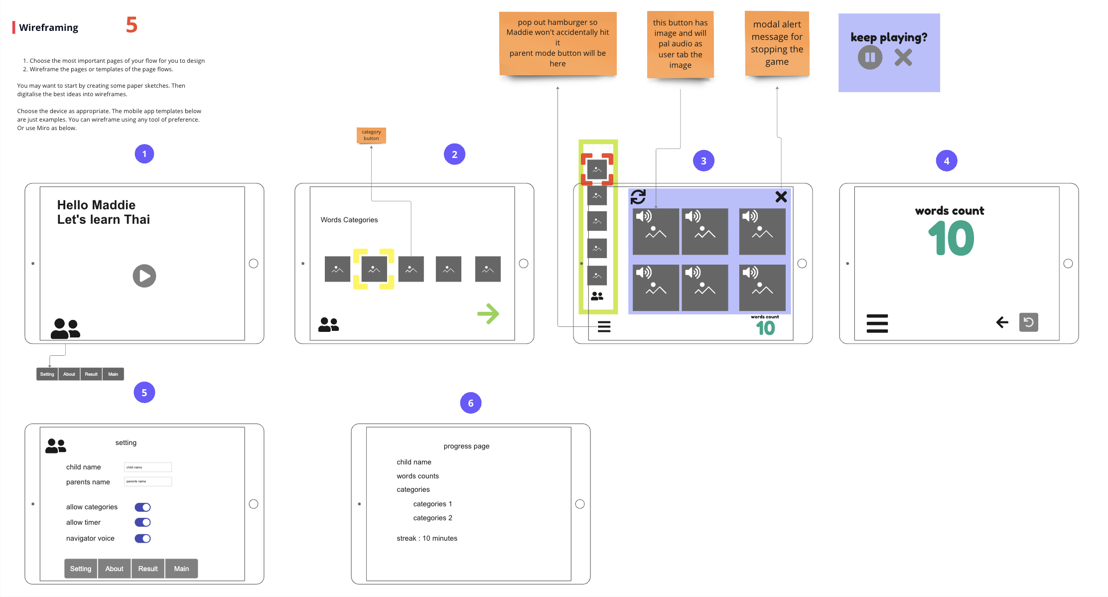
I gained valuable insights that shaped our design decisions by defining the app’s goal and target audience, conducting user research, creating user personas, and understanding the user journey. Mapping out the page flow and creating wireframes allowed us to visualize the app’s structure and ensure intuitive navigation.
In the next blog, I will share my process of finding inspirational images and color themes to create the high-fidelity prototype. Then I’ll perform usability testing next. This is an iterative process, and I’m excited to see what comes next.