Introduction
In today’s digital landscape, crafting websites that cater to diverse users is not just good practice; it’s a cornerstone of responsible web design. An inclusive website ensures that people of all abilities, backgrounds, and preferences can seamlessly access and engage with your content. This blog post will explain fundamental principles and best practices for designing an inclusive and accessible website.
Web Design Accessibility Course Insights
from this course » Udemy
Tools for Accessibility Testing
Creating accessible websites starts with identifying and addressing potential issues efficiently. Utilizing specialized tools can significantly expedite this process. Here are some highly recommended tools:
Lighthouse:
Integrated into the Chrome web browser, Lighthouse offers an accessibility report alongside performance and SEO insights.
VoiceOver:
A built-in screen reader for Mac and iOS devices. Activate it using Cmd + F5 to assess your website’s accessibility.
Windows Screen Readers:
Options like JAWS (with an evaluation version), NVDA (free), and Narrator (built into newer Windows versions) cater to Windows users.
WAVE Web Accessibility Evaluation Tool:
A browser-based tool that evaluates a website’s accessibility, providing a detailed report. Access it at WAVE.
W3C Validator:
The W3C Markup Validation Service ensures HTML validity, critical for correct interpretation by screen readers and browsers.
Understanding Disabilities
Designing for inclusivity requires a deep understanding of potential user limitations. Consider the following key aspects:
- Sight: Varies from 20/20 vision to complete blindness, including considerations for color blindness.
- Hearing: Acknowledge potential exclusions for users who are deaf or have limited hearing.
- Motor: Users with limited motor functions may struggle with precise mouse control; hence, ensuring functional keyboard navigation is crucial.
- Cognitive: Design with clarity and simplicity, recognizing that some users may have learning difficulties, memory problems, autism, or other conditions.
Inclusive Design Best Practices
Semantic HTML and Heading Structure
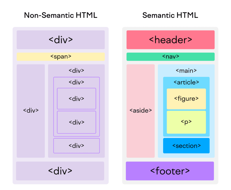
Utilize semantic HTML elements such as <header>, <nav>, <main>, and <footer> for a clear content structure.
Implement descriptive and hierarchical headings (<h1>, <h2>, etc.) to aid screen readers in interpreting content hierarchy.
VoiceOver-Friendly Design
Provide descriptive alt text for images. Ensure smooth and logical keyboard navigation. Implement focus styles to enhance the visibility of interactive elements.
ARIA Tips and Best Practices
Leverage ARIA roles to define the type of user interface element. Implement ARIA landmarks for improved navigation. Announce dynamic content changes with ARIA live regions. Ensure keyboard accessibility for elements with ARIA roles.
Inclusive Design Strategies
Understand your audience and involve diverse stakeholders in the design process. Prioritize accessibility from the initial design phase. Provide multiple means of representation, including text, images, audio, and video. Support flexible input methods, such as keyboard, mouse, touch, and voice.
User Testing and Continuous Improvement
Conduct regular user testing, especially with individuals of varying abilities. Act on user feedback and iteratively improve your design to ensure ongoing accessibility enhancements.
Most Common Issues
To address potential challenges, be vigilant about: Heading hierarchy Insufficient color contrast Focus issues on modals and interactive elements Form inputs without labels Buttons placed too closely to others Lack of captions on video content
Other references:
Semantic HTML example
 Semantic HTML Cheat Sheet
Conclusion
Designing for accessibility is not merely a legal obligation but a commitment to creating a digital space that welcomes everyone. By embracing the principles of semantic HTML, VoiceOver-friendly design, ARIA best practices, and inclusive design strategies, you’re on the path to building websites that offer a seamless experience for users of all abilities. Remember, accessibility is an ongoing commitment that enhances the user-friendliness of your platform. Happy designing!